Chi © 2026
Chi is more than just a fresh food delivery service — it is a bright, playful and modern way to bring everyday freshness closer to people. Inspired by the rhythm of the city, simple ingredients and the joy of good food, Chi combines convenience with a warm, expressive visual language.
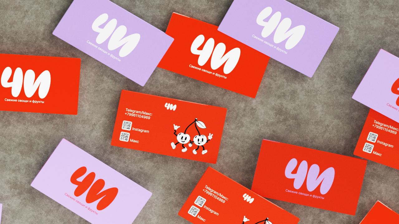
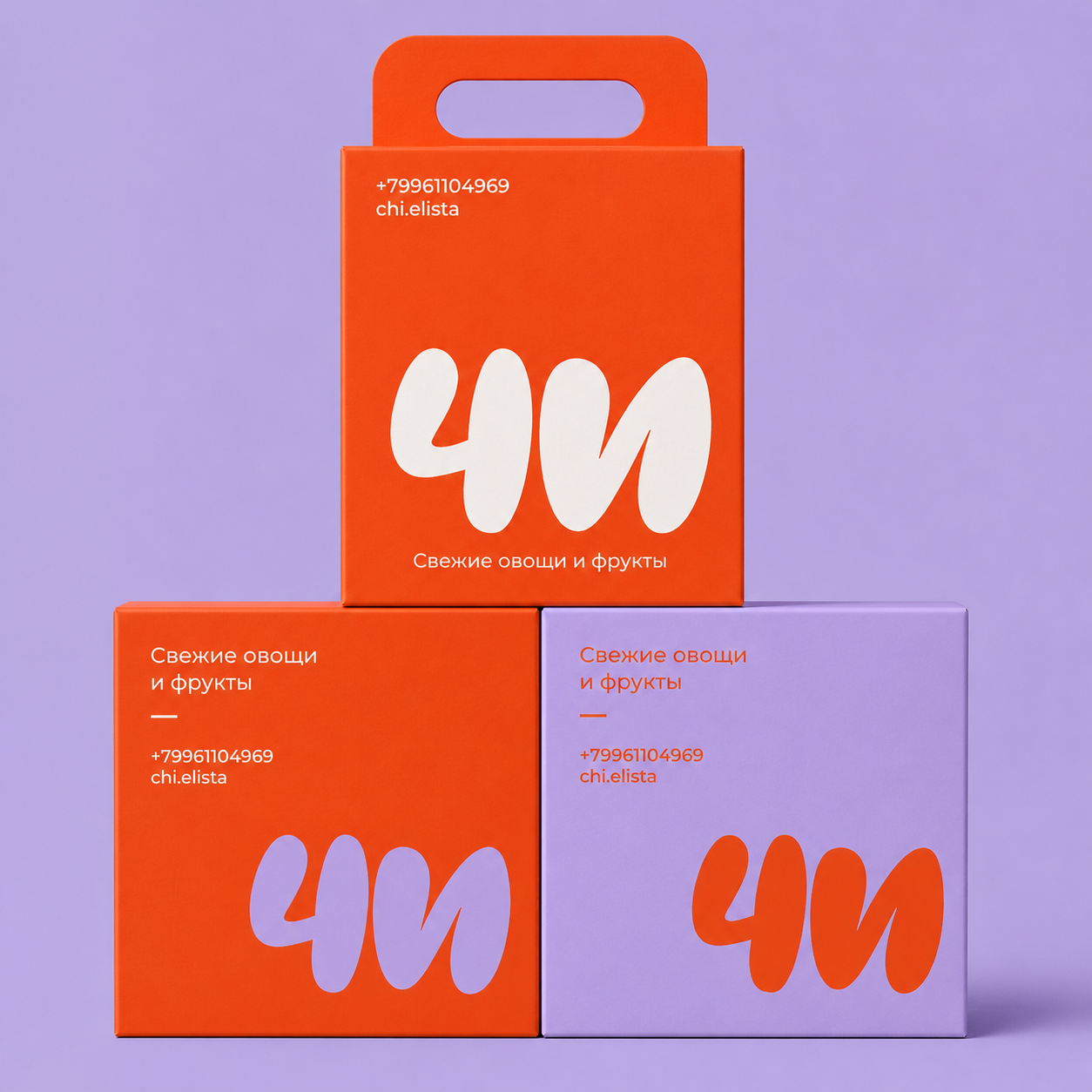
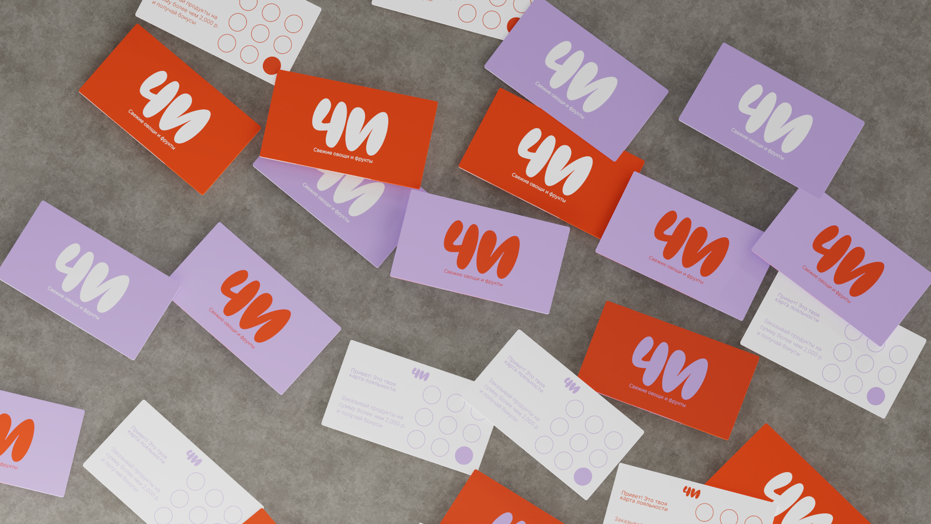
The brand identity reflects the essence of Chi: fresh products, friendly service and a bold contemporary character. From colourful packaging to lively illustrations, every detail is designed to feel approachable, memorable and full of energy.
This case study presents an alternative visual direction created during the concept development stage. Although the client chose a different final route, this version reflects my own creative approach to the brand: bold, playful and highly recognisable.
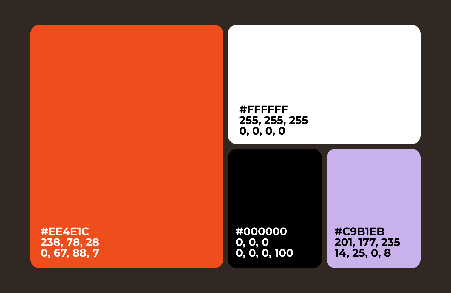
The visual identity of Chi is built around a bold and playful contrast between freshness, energy and simplicity. The bright orange brings a sense of appetite, movement and urban warmth, while clean white and deep black create a confident, modern foundation. The soft lavender adds a friendly and unexpected accent, making the brand feel more expressive, memorable and contemporary.
Together, the colours, typography and graphic elements create a visual language that feels fresh, approachable and full of character. The identity reflects the spirit of Chi: a modern food delivery brand that is simple, energetic and easy to recognise across packaging, social media and everyday city touchpoints.